
4 Ways to Select a Strong Book Cover


The cover of a book is arguably the strongest marketing tool at an author’s disposal. It is the element of a book that is most likely to get a reader to stop, look again, and pick up the book.
The cover is a chance for the author to convey the ideas found within the pages in one fell swoop. And I emphasize the word swoop, as readers that are walking past a bookstore shelf or scrolling through online search results are not spending time studying your cover – they are glancing at it. And a few seconds are all you get to grab their attention.
It is not enough for a cover to be beautiful – it must also be marketable. An author should think about several aspects when determining the best cover for their book – target audience, name recognition, branding – but the best way to start is by asking four important questions:
Is the imagery engaging?
Photos, illustrations, and even type-driven designs can be used to create an image on a cover that is meant to hook the reader. The key here is to focus not on the aesthetics, but on the engagement. This means that when a reader looks at your cover, they are drawn in. They become curious. They want to know what is happening inside.
An example is Aberrations by Penelope Przekop – a fiction title about a woman’s hidden past. The cover makes use of gorgeous colors, but there are two things that make it stand out: the rose is blue, a color that does not exist in nature, and below the rose you see, not another flower, but red curls of hair.
The word Aberrations means something that departs from the expected, and this cover certainly does. It makes a reader wonder what is going on. Why is that rose blue? Whose hair is that? Why is it slightly tangled? What happened to her? The reader is intrigued by the cover – and then they pick it up.

Is the imagery distinctive?
Certain genres of books have certain consistent design elements. However, on a crowded shelf, it greatly helps if your book cover stands out as unique.
The book Reversing The Senses by Martin Hubbard is a business title that teaches readers to access their internal resources in order to achieve success. Within the business genre, however, the cover is unconventional due to the colorful graphic of the mirrored faces. This striking image catches your eye and makes a reader pause for a moment and consider that the insights in the book might be as exceptional as the packaging. And then they pick it up.
Does the text pop?
The text on the cover is also an essential element to consider. A good rule to follow is to place the cover a few feet away and see if you can easily read the text. Are the letters large enough? Is there enough contrast? Does the text appear on a part of the cover that is not too busy with other images? The title should pop! And a reader should be able to read it at a glance.
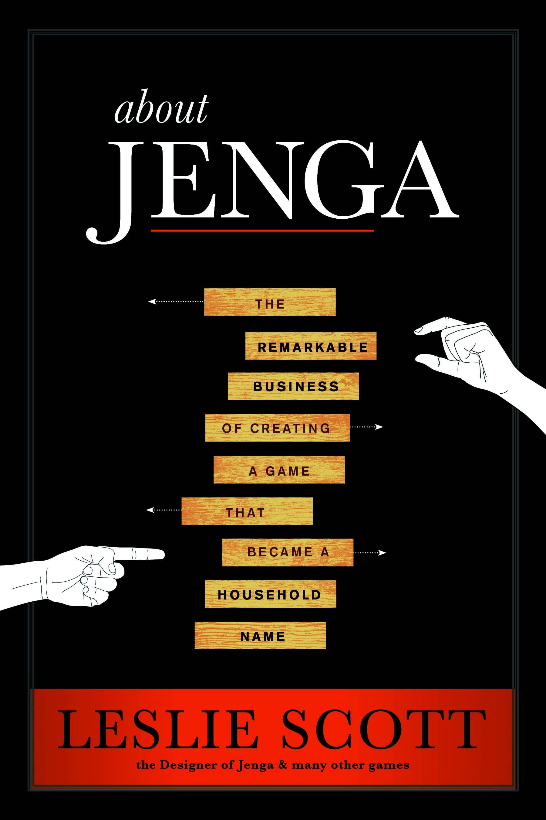
Playing with text can also be a way to increase engagement. For example, About Jenga by Leslie Scott is a business/history title about the entrepreneurism behind the game of Jenga. The bold white text on the solid black background makes the title highly visible, but by placing the subtitle in a smaller font on top of a graphic element, it encourages a reader to look a little closer to discover what the book is all about. And then they pick it up.
Does the cover accurately reflect the content?
A final, and very important, element to consider is the connection between the cover and the content of the book. It is vital that once the reader is hooked, and they pick up your book, the actual topic is what they are expecting and looking for. If you attract the wrong audience for your book with a flashy cover that doesn’t truly reflect your work, you’ll end up with a lot of disappointed readers. Keep the cover true to your content and you can’t go wrong.
To receive more great publishing insights every month, be sure to sign up for the Greenleaf email newsletter. Happy reading!